
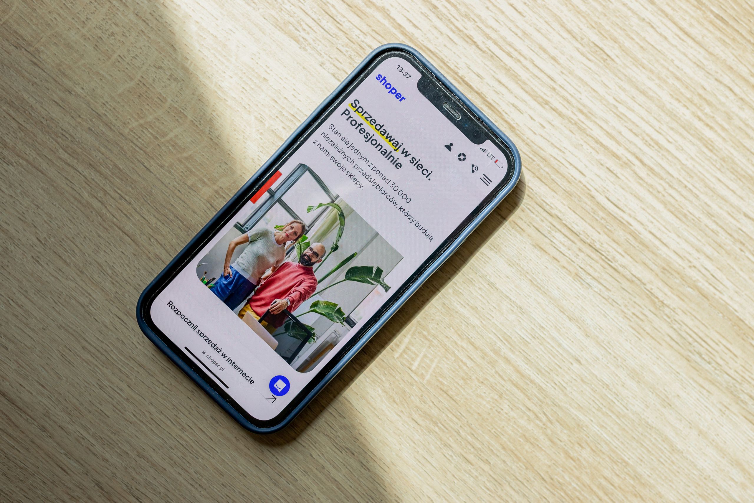
Mobile-First Web Design: Why It Matters More Than Ever
Introduction
Take a moment to think about how often you use your smartphone to search for a business, compare products, read reviews, or make purchases. Chances are, it’s multiple times every day.Today ‘s customers live on their mobile devices. Whether they’re browsing social media, searching on Google, using AI-powered search tools, or shopping online, mobile has become the primary gateway to the internet.
Yet many businesses still treat mobile optimization as an afterthought. That’s a costly mistake.
In 2026, mobile-first web design is no longer just a design trend—it’s a business necessity. Search engines prioritize mobile experiences, customers expect instant access to information, and slow or poorly designed mobile websites can drive potential buyers directly to competitors.
This guide explains what mobile-first web design is, why it matters more than ever, and how businesses can use it to improve SEO, user experience, and conversions.
Direct Answer: What Is Mobile-First Web Design?
Mobile-first web design is an approach where websites are designed and optimized for mobile devices before adapting them for larger screens such as tablets and desktops. Instead of shrinking a desktop website to fit a phone, designers prioritize mobile usability, speed, navigation, and user experience from the beginning. This approach improves SEO, increases conversions, enhances user satisfaction, and aligns with Google’s mobile-first indexing requirements.
Why It Matters
Mobile-first design directly affects:
- Search engine rankings
- User experience
- Conversion rates
- Website speed
- Customer engagement
- Lead generation
- AI search visibility
Businesses that ignore mobile users risk losing both traffic and revenue.
Mobile-First Design at a Glance
| Factor | Mobile-First Design | Traditional Design |
|---|---|---|
| SEO Performance | Excellent | Moderate |
| Mobile User Experience | Excellent | Often Poor |
| Loading Speed | Faster | Slower |
| Conversion Rates | Higher | Lower |
| AI Search Readiness | Better | Limited |
| User Engagement | Strong | Moderate |
| Future Scalability | High | Moderate |
What Is Mobile-First Web Design?
Mobile-first design begins with the smallest screen. Designers first create:
- Mobile layouts
- Mobile navigation
- Mobile content structure
- Mobile user journeys
Once the mobile version is optimized, the design expands for larger screens. This differs from traditional responsive design, where desktop layouts are often created first and then adjusted for mobile devices.
Why Mobile Usage Continues to Grow
Consumer behavior has changed dramatically. Users now rely on smartphones for:
- Local searches
- Online shopping
- Service inquiries
- Booking appointments
- Social media interactions
- Product research
For many businesses, over 70% of website traffic now comes from mobile devices. Ignoring mobile users means ignoring the majority of your audience.
Google’s Mobile-First Indexing Explained
Google now primarily evaluates the mobile version of a website when determining rankings. This process is called Mobile-First Indexing.
Google examines:
- Mobile content
- Mobile usability
- Mobile speed
- Mobile structure
If your mobile website performs poorly, your rankings can suffer—even if the desktop version is excellent.
How Mobile-First Design Impacts SEO
Search engine optimization and mobile usability are now closely connected.
Improved Crawlability
Mobile-friendly websites are easier for search engines to understand.
Better User Signals
Google monitors user behavior such as:
- Bounce rates
- Time on page
- Engagement
Positive user experiences support stronger rankings.
Faster Loading Speeds
Speed remains a ranking factor. Mobile-first websites are often optimized for performance.
Enhanced Core Web Vitals
Core Web Vitals measure:
- Loading performance
- Responsiveness
- Visual stability
Mobile-first design helps improve these important metrics.
Greater Visibility in AI Search
AI search engines favor websites with:
- Structured content
- Fast performance
- Clear information architecture
Mobile-first design supports all three.
The Business Benefits of Mobile-First Design
Higher Conversion Rates
Users are more likely to:
- Submit forms
- Call businesses
- Request quotes
- Complete purchases
when mobile experiences are smooth and intuitive.
Better Customer Satisfaction
Customers expect convenience. A well-designed mobile experience creates trust and professionalism.
Increased Engagement
Mobile users stay longer on websites that are easy to navigate.
More Leads
Lead generation forms that work well on mobile devices often generate significantly better results.
Competitive Advantage
Many businesses still have poor mobile experiences. A mobile-first website immediately stands out.
Key Elements of Mobile-First Web Design
Simple Navigation
Mobile screens offer limited space. Navigation should be:
- Clear
- Intuitive
- Easy to access
Fast Loading Times
Every second matters. Slow websites increase abandonment rates. Optimization techniques include:
- Image compression
- Browser caching
- Code minification
Responsive Layouts
Content should adapt seamlessly across devices.
Touch-Friendly Design
Buttons and links must be easy to tap. Avoid:
- Tiny buttons
- Crowded layouts
Readable Typography
Text should be easy to read without zooming.
Optimized Forms
Reduce friction by:
- Minimizing fields
- Using large input areas
- Supporting autofill
Mobile-First Design and AI Search
AI-powered search engines continue transforming online discovery. AI systems prefer websites with:
- Structured information
- Clear headings
- Fast performance
- User-friendly experiences
Mobile-first design contributes directly to these requirements. Businesses preparing for the future of search should prioritize mobile optimization.
Common Mobile Design Mistakes
- Slow Page Speeds: Large images and excessive scripts can hurt performance.
- Desktop-First Thinking: Designing for desktop first often creates mobile usability issues
- Tiny Buttons: Small touch targets frustrate users.
- Pop-Up Overload: Aggressive pop-ups can damage user experience.
- Poor Navigation: Complicated menus make mobile browsing difficult.
- Unoptimized Images: Large files slow page loading.
- Difficult Forms: Long forms discourage conversions.
Mobile-First Design Best Practices for 2026
- Prioritize Speed: Optimize every element for fast loading.
- Design for Thumbs: Consider how users naturally hold smartphones.
- Use Clear Calls-to-Action: Make important actions obvious. Examples
- Call Now
- Request Quote
- Book Consultation
- Keep Layouts Clean: Reduce unnecessary clutter.
- Test Across Devices: Verify performance on:
- Android phones
- iPhones
- Tablets
- Monitor User Behavior: Analyze:
- Bounce rates
- Conversion rates
- Session duration
- Focus on Accessibility: Mobile-first websites should remain accessible to all users.
Why Mobile-First Design Matters for Small Businesses
Small businesses often compete with larger companies that have bigger marketing budgets. A mobile-first website helps level the playing field. Benefits include:
- Better local SEO
- More inquiries
- Improved credibility
- Higher conversion rates
For local service businesses, mobile users frequently become customers within hours of searching.
How Mobile-First Design Supports Local SEO
Local searches are overwhelmingly mobile. Examples include:
- “Website designer near me”
- “SEO company near me”
- “Best digital marketing agency”
Google prioritizes businesses that provide excellent mobile experiences.
Mobile-first design helps:
- Improve local rankings
- Increase map visibility
- Generate more calls
Mobile-First Design and Website Speed
Website speed remains one of the most important ranking and conversion factors. Fast mobile websites:
- Reduce bounce rates
- Improve engagement
- Increase conversions
- Strengthen SEO
Studies consistently show that users abandon slow websites quickly.
How Ash Web Work Builds Mobile-First Websites
At Ash Web Work, we understand that modern websites must perform exceptionally on mobile devices. Our web design approach includes:
- Mobile-first development
- Responsive design
- SEO optimization
- Core Web Vitals improvements
- Fast-loading architecture
- AI-friendly website structures
- Conversion-focused layouts
We help small businesses, startups, and local companies create websites that not only look great but also generate measurable results.
Common Mistakes to Avoid
- Ignoring Mobile Testing: Always test websites on real devices.
- Prioritizing Desktop Design: Mobile users should come first.
- Using Large Media Files: Optimize all images and videos.
- Overcomplicated Menus: Keep navigation simple.
- Poor CTA Placement: Calls-to-action should be visible without excessive scrolling.
- Neglecting Mobile SEO: Mobile optimization directly impacts rankings.
- Focusing Only on Appearance: Usability matters as much as design.
Frequently Asked Questions
1. What is mobile-first web design?
Mobile-first web design prioritizes creating websites for mobile devices before adapting them for larger screens.
2. Why is mobile-first design important for SEO?
Google uses mobile-first indexing, meaning the mobile version of your website is primarily evaluated for rankings.
3. Does mobile-first design improve conversions?
Yes. Better usability, faster speeds, and improved user experiences often lead to higher conversion rates.
4. Is mobile-first design different from responsive design?
Yes. Mobile-first design starts with mobile layouts, while responsive design often begins with desktop layouts and adjusts for smaller screens.
5. How does mobile-first design affect website speed?
Mobile-first websites are generally optimized for performance, resulting in faster loading times and improved user experiences.
6. Can mobile-first design help local SEO?
Absolutely. Most local searches occur on mobile devices, making mobile optimization critical for local visibility.
7. Is mobile-first design important for AI search engines?
Yes. AI search systems favor websites with fast performance, structured content, and excellent user experiences—all supported by mobile-first design.
Conclusion
Mobile-first web design is no longer optional in 2026. It influences SEO rankings, user experience, AI search visibility, lead generation, and conversion rates. As mobile traffic continues to dominate the internet, businesses that prioritize mobile users gain a significant competitive advantage.
By focusing on speed, usability, accessibility, and mobile-first experiences, companies can create websites that satisfy both users and search engines. The future of web design is mobile-first—and that future is already here.
Call to Action
Is your website truly optimized for mobile users?
At Ash Web Work, we specialize in mobile-first web design, WordPress development, website speed optimization, SEO, AI-friendly websites, and conversion-focused digital experiences.
Whether you’re launching a new website or improving an existing one, our team can help you create a faster, smarter, and more effective online presence.
Contact Ash Web Work today and discover how a mobile-first website can help your business generate more traffic, more leads, and more sales in 2026 and beyond.