Best Color Psychology Strategies for Business Websites
Introduction
Did you know visitors form an opinion about your website in less than a second? While website speed, content, and usability are essential, color is often the first thing users notice. The colors you choose influence how visitors feel about your brand, whether they trust your business, and ultimately whether they become customers.
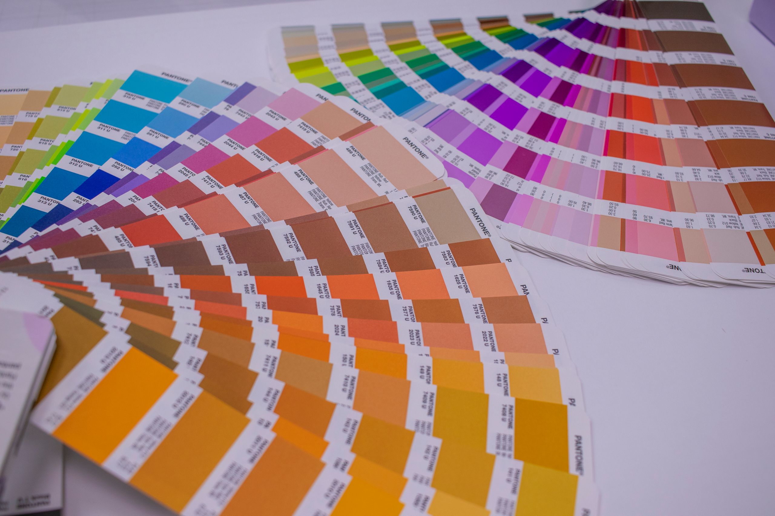
Color psychology is more than making a website look attractive. It is about using strategic color choices to communicate professionalism, evoke emotions, guide user behavior, and increase conversions. Successful brands carefully select their color palettes because every color sends a psychological message. For small businesses, startups, and local companies, using color psychology effectively can create a stronger brand identity without increasing marketing costs. A thoughtfully designed website can improve credibility, encourage users to stay longer, and help convert visitors into paying customers.
In this guide, you’ll learn the best color psychology strategies for business websites, common mistakes to avoid, and practical techniques to improve your website’s performance in 2026 and beyond.
Quick Answer (Featured Snippet)
Color psychology helps business websites increase conversions by using colors that influence emotions and decision-making. Blue builds trust, green represents growth, red creates urgency, orange encourages action, and black conveys luxury. Choosing the right color palette improves user experience, strengthens branding, and increases customer confidence.
Color Psychology at a Glance
| Goal | Recommended Colors | Psychological Effect |
|---|---|---|
| Build Trust | Blue | Reliability, security, professionalism |
| Increase Sales | Orange, Red | Action, urgency, excitement |
| Promote Health | Green | Growth, wellness, balance |
| Luxury Branding | Black, Gold | Premium quality, exclusivity |
| Creativity | Purple | Innovation, imagination |
| Simplicity | White | Cleanliness, clarity |
| Energy | Yellow | Optimism, positivity |
Why Color Psychology Matters
Many business owners focus on website layouts, SEO, or content while overlooking one of the strongest conversion factors: visual perception. Every visitor makes subconscious judgments about your business before reading a single sentence. Your color choices influence those judgments immediately. Effective color psychology helps businesses:
- Build trust quickly
- Increase user engagement
- Improve brand recognition
- Guide visitors toward important actions
- Reduce bounce rates
- Strengthen emotional connections
- Increase conversion rates
For example: A financial advisor using bright neon colors may appear less trustworthy than one using navy blue and white. A children’s toy store using soft gray colors may appear boring compared to one using bright, energetic colors. The right colors align with customer expectations and reinforce your brand message.
The Science Behind Color Psychology
Human brains process visual information much faster than text. Research consistently shows that people form first impressions almost instantly, and color plays a significant role in those impressions. Color affects:
- Attention
- Memory
- Emotions
- Purchase decisions
- Brand recall
- User confidence
While cultural differences can influence color perception, several color associations remain consistent across many industries. That is why successful companies invest heavily in branding guidelines and maintain consistent color usage across websites, social media, advertising, and marketing materials.
Understanding the Meaning of Popular Website Colors
Blue – Trust and Professionalism
Blue is one of the most widely used business colors because it creates feelings of reliability, stability, and confidence. Ideal for:
- Financial services
- Technology companies
- Healthcare providers
- Law firms
- B2B businesses
- Corporate websites
Blue works especially well for businesses that want visitors to feel safe sharing personal information or making online purchases.
Green – Growth and Wellness
Green represents:
- Nature
- Health
- Sustainability
- Balance
- Financial growth
It is commonly used by:
- Organic brands
- Healthcare providers
- Environmental companies
- Financial advisors
- Agriculture businesses
Green also creates a calm browsing experience that encourages visitors to stay longer.
Red – Excitement and Urgency
Red immediately attracts attention. It communicates:
- Energy
- Passion
- Urgency
- Importance
Businesses often use red for:
- Limited-time offers
- Sale banners
- Clearance sections
- Restaurant promotions
- Call-to-action buttons
Because red creates urgency, it should be used strategically rather than throughout an entire website.
Orange – Action and Enthusiasm
Orange combines the energy of red with the friendliness of yellow. It is excellent for:
- CTA buttons
- Newsletter signups
- Promotional banners
- Free trial offers
- Download buttons
Many high-converting landing pages use orange buttons because they naturally attract attention without appearing overly aggressive.
Yellow – Optimism and Energy
Yellow communicates:
- Happiness
- Positivity
- Creativity
- Warmth
It works well for:
- Creative agencies
- Educational websites
- Children’s brands
- Entertainment companies
However, excessive yellow can reduce readability and overwhelm users.
Black – Luxury and Authority
Black represents:
- Sophistication
- Premium quality
- Luxury
- Power
Popular industries include:
- Fashion
- Jewelry
- Luxury automobiles
- Premium consulting
- High-end products
Minimalist black designs often create a premium feel when paired with clean typography.
White – Simplicity and Clarity
White space is just as important as color. It helps:
- Improve readability
- Reduce distractions
- Create balance
- Make content easier to scan
- Highlight important elements
Many modern business websites rely heavily on white backgrounds because they improve usability and professionalism.
Best Color Psychology Strategies for Business Websites
1. Understand Your Target Audience
Before selecting colors, understand who your ideal customers are. Ask questions like:
- What emotions should visitors feel?
- Are they professionals or consumers?
- Are they looking for trust or excitement?
- What age group are you targeting?
- What industry are you serving?
Different audiences respond differently to colors. A law firm should look trustworthy. A gaming company should look energetic. A luxury brand should look premium.
2. Match Colors With Your Brand Personality
Your website colors should reflect your business identity. Examples:
- Reliable → Blue
- Eco-friendly → Green
- Innovative → Purple
- Premium → Black
- Friendly → Orange
- Energetic → Red
Consistency across your website, logo, social media, and marketing materials strengthens brand recognition.
3. Limit Your Color Palette
One common design mistake is using too many colors. A professional website typically includes:
- One primary brand color
- One secondary color
- One accent color
- Neutral backgrounds
- Neutral text colors
Keeping your palette simple creates a clean, cohesive experience and makes important elements stand out.
4. Use High-Contrast Call-to-Action Buttons
Your CTA buttons should immediately catch the visitor’s attention. Examples:
- Orange button on a white background
- Green button on dark blue
- Red button for limited offers
- Blue button on light gray
The goal is to make the desired action obvious without overwhelming the rest of the page.
5. Use White Space Strategically
White space is not wasted space. It helps users focus on:
- Headlines
- Call-to-action buttons
- Product images
- Contact forms
- Testimonials
Crowded pages reduce readability and increase bounce rates. Professional websites intentionally leave room around important elements to improve visual hierarchy.
6. Create Visual Hierarchy With Color
Not every element deserves equal attention. Use your strongest colors for:
- Primary CTA buttons
- Important offers
- Contact forms
- Key headlines
Use softer, neutral colors for supporting information so visitors naturally focus on the actions that matter most.
7. Maintain Consistent Brand Colors
Consistency builds familiarity, and familiarity builds trust. Use the same primary colors across your:
- Website
- Logo
- Social media profiles
- Email newsletters
- Digital advertisements
- Business cards
- Marketing materials
When customers repeatedly see the same visual identity, they are more likely to remember your brand. This consistency improves brand recognition and creates a more professional image.
8. Consider Cultural Differences
If your business serves an international audience, remember that colors can have different meanings in different cultures. For example:
- White often symbolizes purity in Western countries but may represent mourning in some Asian cultures.
- Red symbolizes urgency or danger in some regions, while it represents luck and prosperity in others.
- Green is associated with nature in many countries but may have different cultural associations elsewhere.
Research your target audience before finalizing your website’s color palette.
9. Optimize Colors for Accessibility
A visually appealing website should also be accessible. Best practices include:
- High contrast between text and background
- Avoid relying only on color to communicate important information
- Use readable font sizes
- Ensure buttons remain distinguishable for color-blind users
- Test your website on different devices and screen brightness levels
An accessible website improves usability for all visitors while helping meet modern web standards.
10. Test Before Making Permanent Changes
Never assume one color will always outperform another. Instead, run A/B tests on:
- CTA button colors
- Banner backgrounds
- Contact form buttons
- Pricing sections
- Promotional banners
Even small color adjustments can improve click-through rates and conversions. Data should guide your design decisions rather than personal preferences.
Common Issues To Look Out
Even well-designed websites can lose conversions because of poor color choices. Watch out for these common issues:
- Using too many bright colors that compete for attention.
- Choosing colors based only on personal preference instead of customer expectations.
- Using low-contrast text that reduces readability.
- Inconsistent colors across pages, weakening brand recognition.
- Making every button the same color, so primary actions don’t stand out.
Avoiding these mistakes creates a cleaner, more professional experience that builds trust and encourages visitors to take action.
Industry-Specific Color Recommendations
Different industries benefit from different emotional associations.
| Industry | Recommended Colors | Why They Work |
|---|---|---|
| Healthcare | Blue, Green, White | Trust, health, cleanliness |
| Finance | Blue, Gray | Stability and security |
| Restaurants | Red, Orange, Yellow | Appetite and excitement |
| Real Estate | Blue, White, Dark Gray | Professionalism and trust |
| Law Firms | Navy Blue, White | Authority and confidence |
| Technology | Blue, Purple | Innovation and reliability |
| Beauty | Pink, White, Black | Elegance and style |
| Luxury Brands | Black, Gold | Exclusivity and premium quality |
| Education | Blue, Green | Learning and growth |
| E-commerce | White with bold accent colors | Focus on products and CTAs |
Why It Matters
Your website is often the first interaction a potential customer has with your business. Within seconds, visitors decide whether your business appears:
- Professional
- Trustworthy
- Modern
- Reliable
- Worth contacting
Color influences each of these perceptions. A carefully chosen color strategy can:
- Increase visitor confidence
- Improve engagement
- Strengthen brand identity
- Encourage users to complete forms
- Increase online sales
- Improve lead generation
For small businesses and startups, these improvements can significantly impact revenue without increasing advertising costs.
Common Mistakes to Avoid
Avoid these common color psychology mistakes:
- Using Too Many Colors: A cluttered palette creates confusion and weakens brand recognition.
- Ignoring Brand Identity: Choose colors that reflect your business values rather than following temporary design trends.
- Poor Contrast: Light gray text on a white background may look modern but is difficult to read.
- Copying Competitors: Competitor research is useful, but your brand should have its own visual identity.
- Overusing Bright Colors: Too many vibrant colors compete for attention and overwhelm visitors.
- Forgetting Mobile Users: Colors may appear differently on mobile devices. Test your website across multiple screens.
- Never Testing: Monitor user behavior and conversion data before making major design decisions.
Best Practices for Using Color Psychology
Follow these proven best practices:
- Choose one primary brand color.
- Use two complementary secondary colors.
- Reserve bold colors for calls-to-action.
- Maintain consistent branding across all channels.
- Use white space generously.
- Prioritize readability over aesthetics.
- Test button colors regularly.
- Keep navigation simple.
- Use color to guide user attention naturally.
- Review your color palette annually as your brand evolves.
Real-World Example
Imagine two local accounting firms.
Website A
- Bright red background
- Neon green buttons
- Yellow headings
- Multiple competing colors
- Cluttered layout
Visitors may feel overwhelmed and question the company’s professionalism.
Website B
- White background
- Navy blue branding
- Green CTA buttons
- Clean typography
- Consistent design
Visitors are more likely to perceive the business as trustworthy, organized, and credible. The second website creates a stronger first impression without changing the services offered—only the presentation.
Key Takeaways
- Color psychology influences first impressions and buying decisions.
- Blue builds trust, while green suggests growth and balance.
- Red creates urgency, and orange encourages action.
- Black communicates luxury and authority.
- White space improves readability and focus.
- Consistent branding strengthens recognition.
- Accessibility and contrast improve user experience.
- A/B testing helps identify the highest-converting color combinations.
Frequently Asked Questions
1. What is color psychology in web design?
Color psychology is the study of how colors influence emotions, perceptions, and user behavior. In web design, it helps businesses create trust, guide visitors toward important actions, and improve conversions through strategic color choices.
2. Which color is best for increasing website conversions?
There is no universal “best” color. Orange, green, and blue often perform well because they attract attention while maintaining trust. The most effective choice depends on your audience, brand, and the contrast with surrounding elements. Regular A/B testing provides the most reliable answer.
3. Does color psychology really affect purchasing decisions?
Yes. Color influences first impressions, emotional responses, and perceived trustworthiness. While purchasing decisions also depend on pricing, product quality, and user experience, strategic color use can positively impact conversion rates and engagement.
4. How many colors should a business website use?
Most professional websites work well with three to five core colors:
- One primary brand color
- One or two secondary colors
- One accent color for calls-to-action
- Neutral colors for backgrounds and text
Keeping the palette limited creates a clean and recognizable visual identity.
5. Should every industry use the same colors?
No. Different industries benefit from different emotional associations. Healthcare often uses blue and green, luxury brands frequently choose black and gold, while restaurants may use red or orange to stimulate appetite and encourage action.
6. Can changing button colors improve conversions?
Yes. High-contrast CTA buttons are more noticeable and can increase click-through rates. However, results vary depending on your audience and design. Testing different button colors helps identify what performs best for your website.
7. How can small businesses apply color psychology effectively?
Start by understanding your audience and brand personality. Use a consistent color palette, prioritize readability, highlight important actions with contrasting colors, and regularly test performance. Even simple improvements can enhance trust and increase conversions.
Conclusion
Color psychology is one of the most powerful yet overlooked elements of successful website design. Every color on your website communicates a message, influences emotions, and shapes how visitors perceive your business.
When used strategically, color can strengthen your brand identity, improve user experience, build trust, and encourage visitors to take meaningful actions. Combined with fast loading speeds, high-quality content, clear navigation, and strong SEO, an effective color strategy becomes a valuable asset for long-term business growth.
Rather than choosing colors based solely on personal preference, make decisions that align with your audience, industry, and business goals. Review your website regularly, test different approaches, and refine your design based on user behavior and performance data.
Call to Action
Your website should do more than look attractive—it should inspire confidence and convert visitors into customers.
At Ash Web Work, we specialize in designing professional, conversion-focused websites for small businesses, startups, and local companies. From strategic color psychology and modern UI/UX design to SEO optimization, WordPress development, Shopify stores, and high-performance business websites, we create digital experiences that help businesses grow.
If your current website isn’t generating the leads or sales you expect, now is the perfect time to upgrade.
Contact Ash Web Work today for a professional website audit and discover how strategic design, smart color choices, and SEO-driven development can transform your online presence into a powerful business growth tool.